
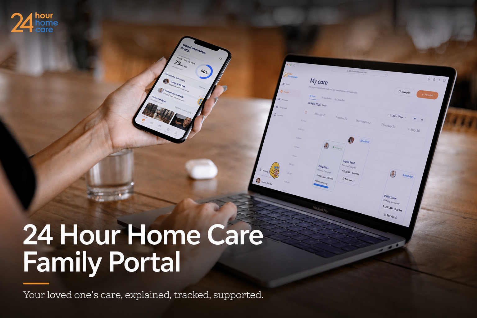
-
Jan 2026 - April 2026
14-week sponsored studio in collaboration with 24 Hour Home Care and ArtCenter College of Design.
-
UX Designer, Product Designer, User Researcher, Creative Designer
• User Research
• Stakeholder Interviews
• Workflow Analysis
• UX Strategy
• Information Architecture
• Wireframing
• UI Design
• Interactive Prototype
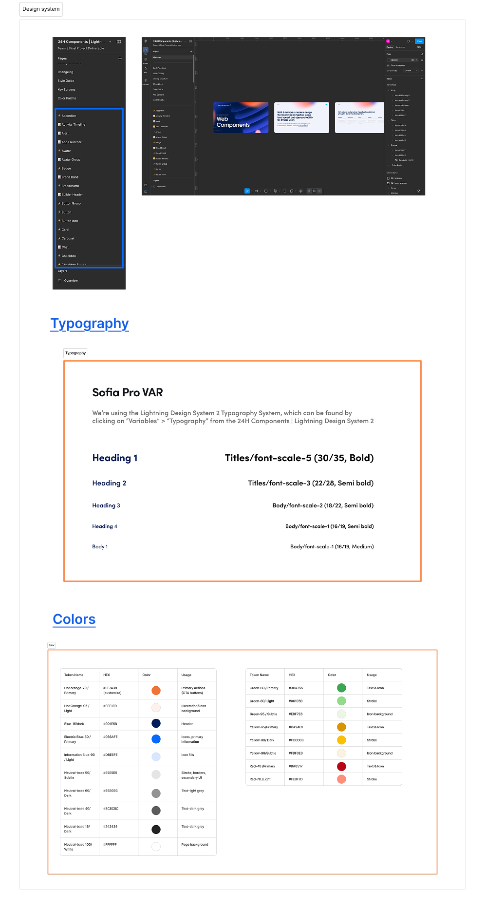
• Design System
• Usability Testing
-
Sponsor: 24 Hour Home Care
Faculty: Trevor Greenleaf, Christine Sheller
Design Team: Zibo Chen, Bri Mai, Silvia Zhang, Xiaoyuan Zhou
-
Figma, Salesforce Community, Adobe Creative Cloud, ChatGPT, Claude, Kling AI, Nano Banana
Project Summary
24 Hour Home Care partnered with ArtCenter College of Design to redesign the digital experience for families navigating disability home care services. Four design teams worked in parallel to address the same design challenge.
Through stakeholder interviews, workflow analysis, and operational data analysis, we identified that the primary challenge was not a lack of features, but a lack of transparency throughout the care journey. We designed a family portal centered around real-time care tracking, authorization visibility, and AI-assisted self-service to improve transparency, empower families, and streamline customer support.
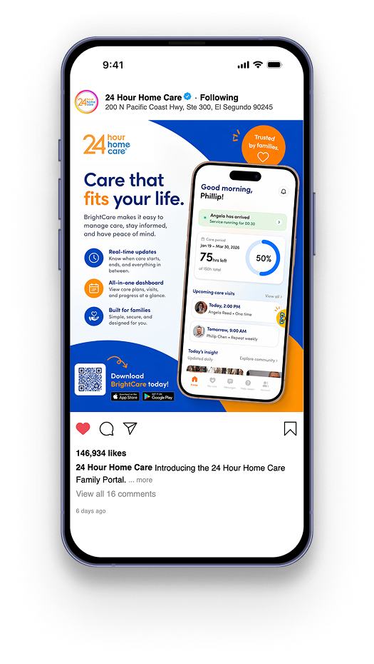
The project included an end-to-end product experience across mobile and desktop platforms, a scalable design system built with Salesforce Lightning and custom components, and launch-ready marketing assets.
Among the four competing teams, our team’s solution was ultimately selected by 24 Hour Home Care for acquisition and future product development.
Business context & challenge
24 Hour Home Care provides both long-term (Disability Services) and short-term (Community Supports) non-medical home care services for individuals with intellectual and developmental disabilities across California.
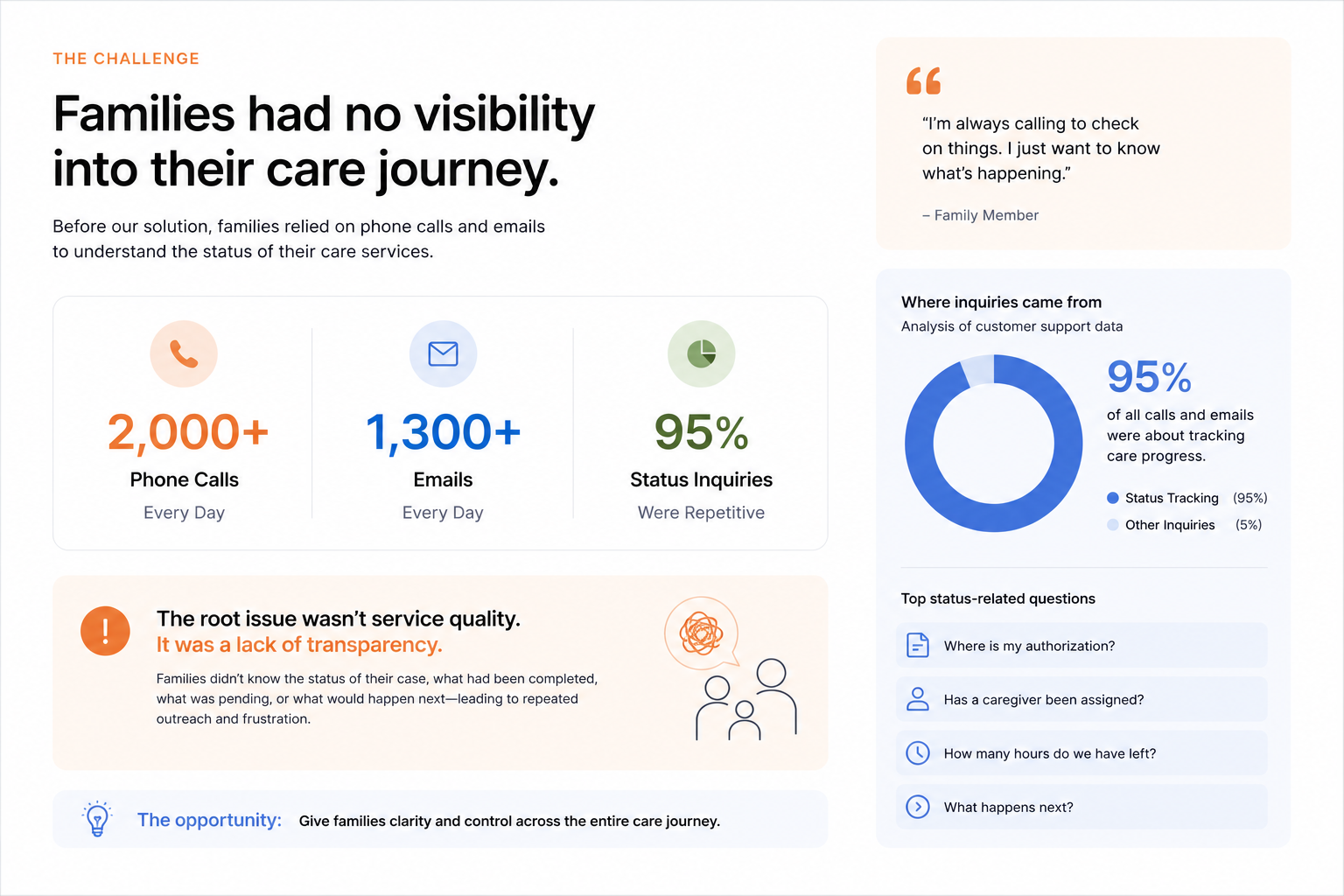
While caregivers already had access to a dedicated mobile app for timekeeping and service management, families had no digital tool to monitor the progress of their care services. Without visibility into their care journey, families relied heavily on phone calls and emails for updates, creating unnecessary operational overhead for customer support while leaving families feeling uncertain and anxious throughout the process.
RESEARCH & discovery
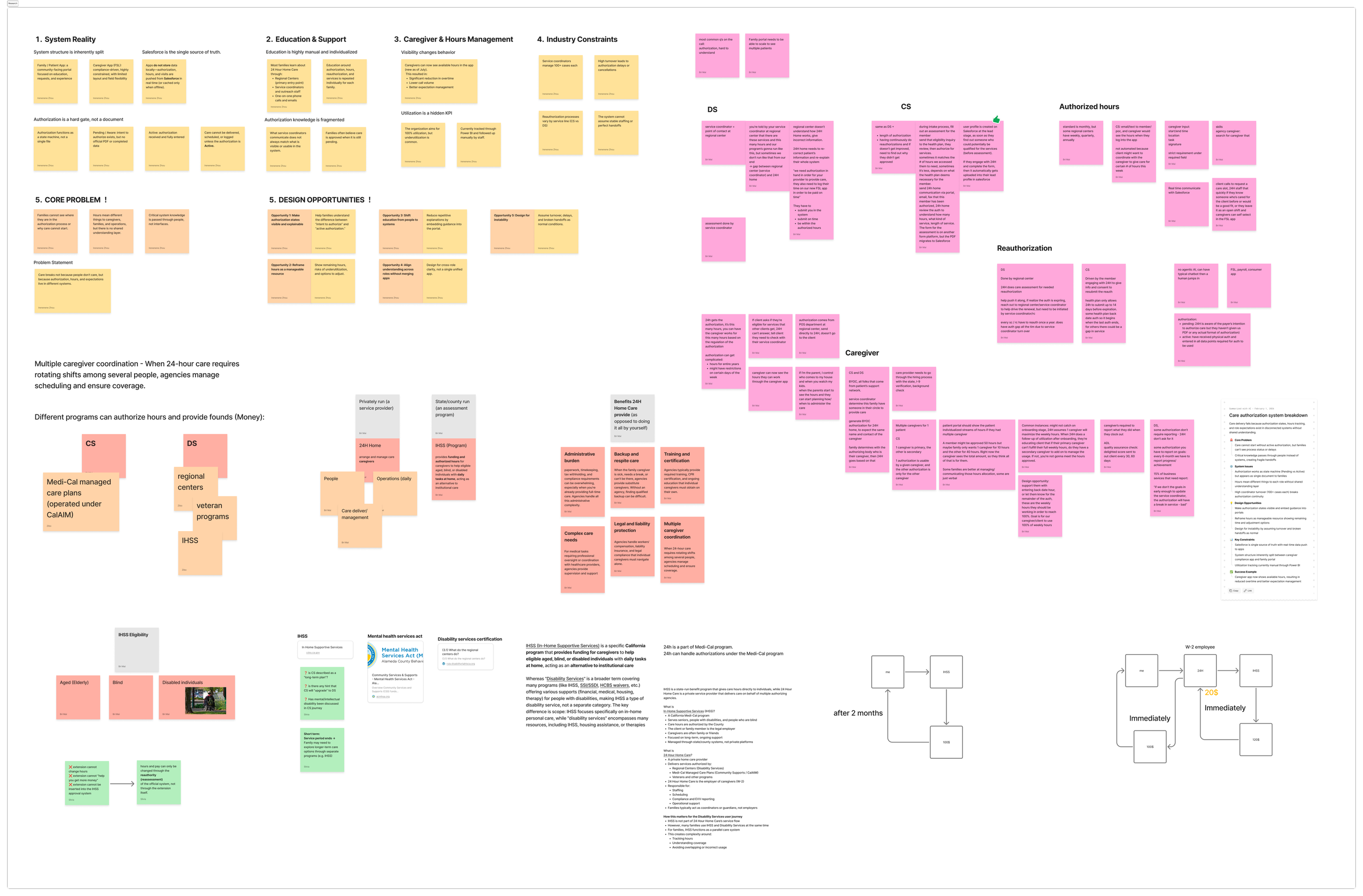
To build a holistic understanding of the service ecosystem, we conducted research across both Disability Services (DS) and Community Supports (CS). Our research combined stakeholder interviews, secondary research, and user-centered methods, including personas and journey mapping, to understand business operations, regulatory constraints, and user needs. By bringing these perspectives together, we uncovered the underlying challenges shared across different service programs and translated them into actionable design opportunities.
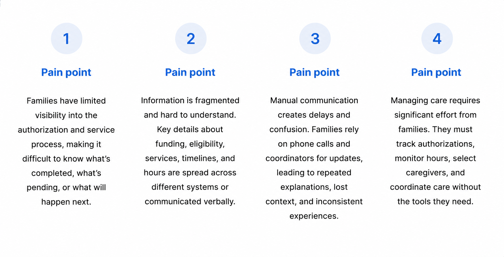
Pain points
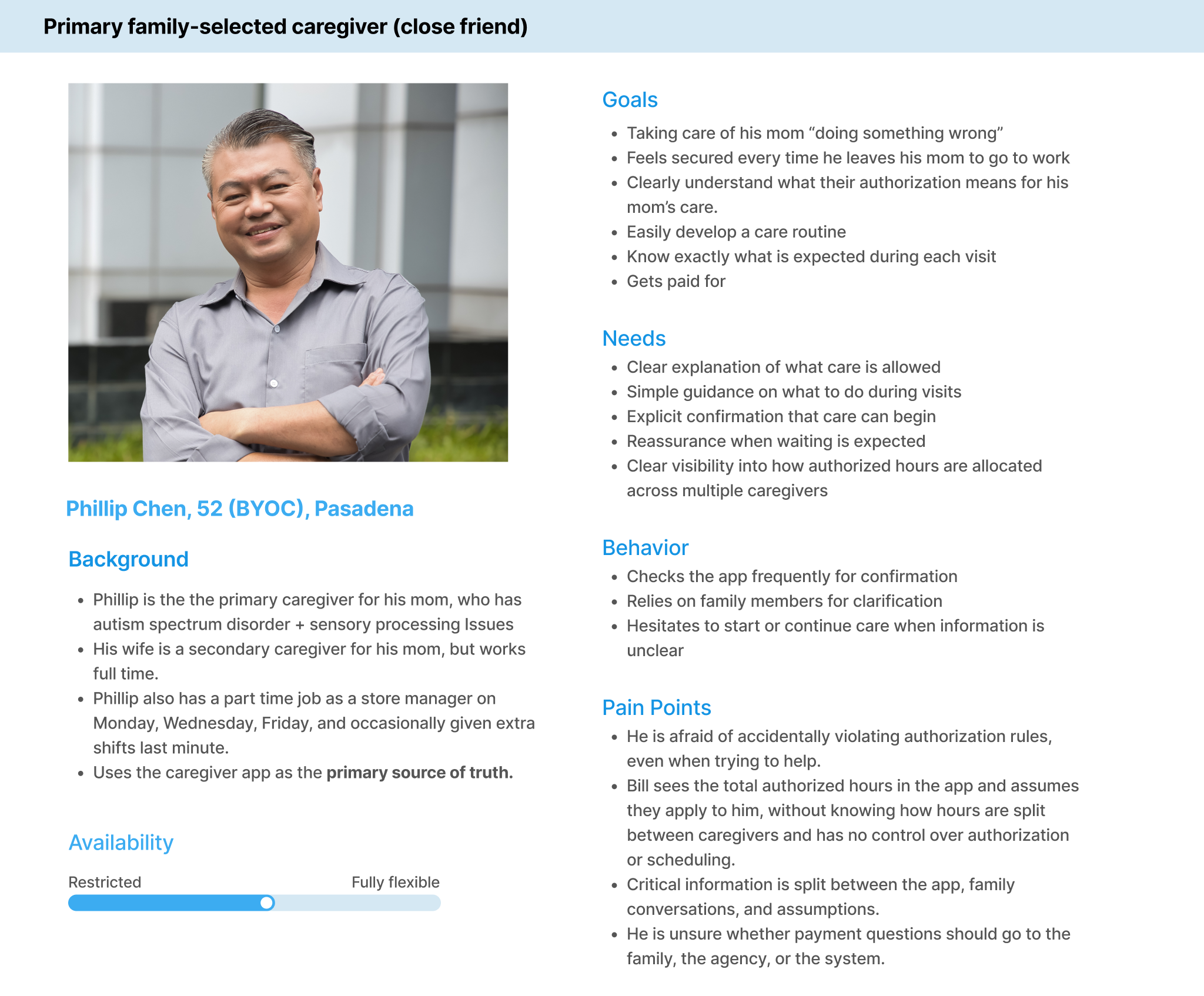
Persona: Phillip
Problem statement
Phillip is the primary caregiver for his mother who needs a simple way to track authorizations, care progress, and allocated service hours because fragmented information and unclear communication leave him feeling uncertain about what actions to take next.
user journey maps
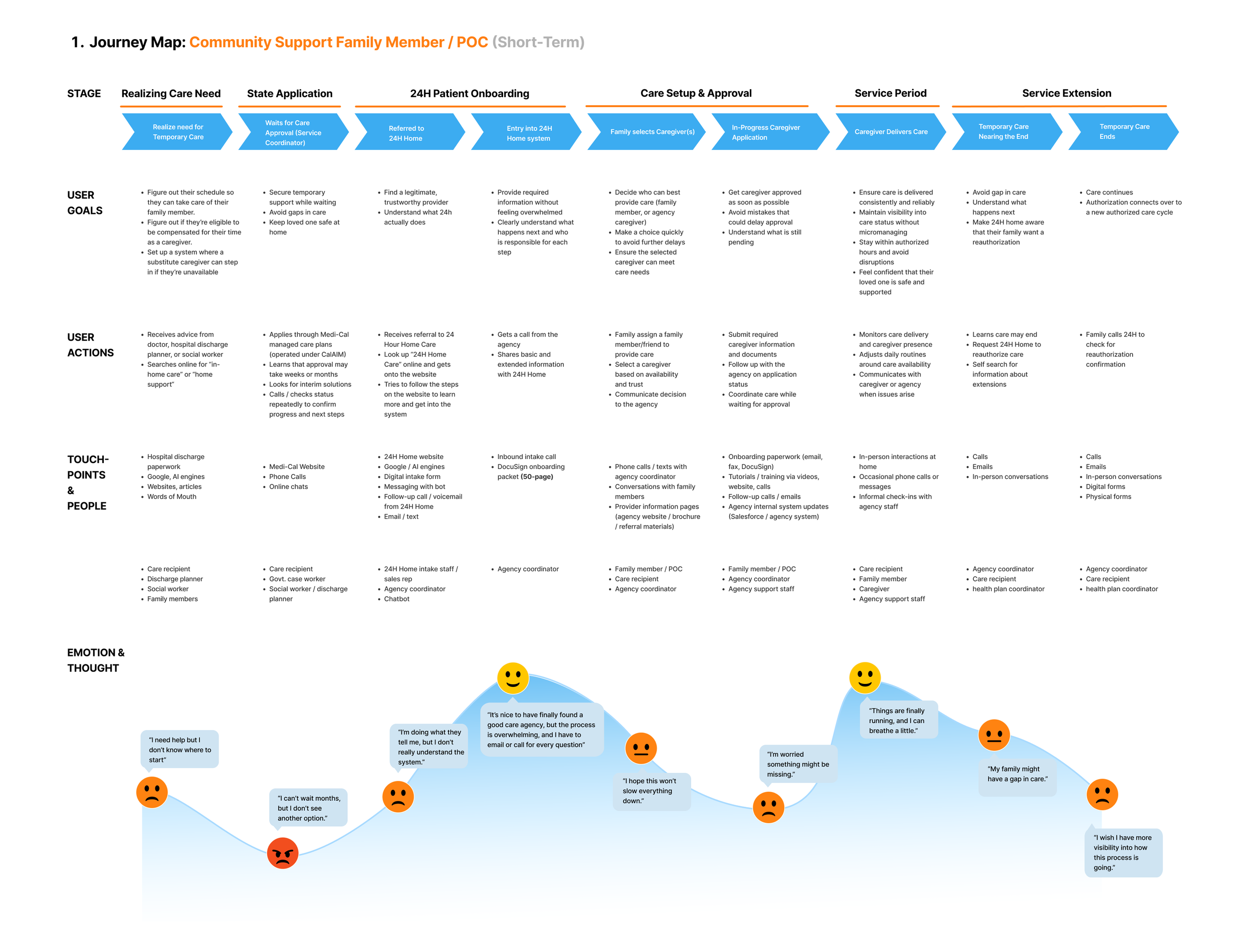
To better understand how different service models shape the family experience, we mapped two end-to-end user journeys: Community Supports (short-term care) and Disability Services (long-term care). While each follows a different operational workflow, both reveal the same underlying challenge, families struggle to maintain visibility throughout their care journey.
Community Supports (CS)
Community Supports focuses on short-term care services, where families are primarily concerned with quickly accessing care and understanding when services can begin. This journey highlights the uncertainty surrounding onboarding, authorization, and service initiation, revealing how limited visibility creates repeated follow-ups and delays throughout the process.
Disability Services (DS)
Disability Services represents a long-term care journey, where families must continuously manage authorizations, caregiver coordination, and service renewals over an extended period. Unlike Community Supports, this journey emphasizes maintaining continuity of care and reducing the ongoing administrative burden placed on families.
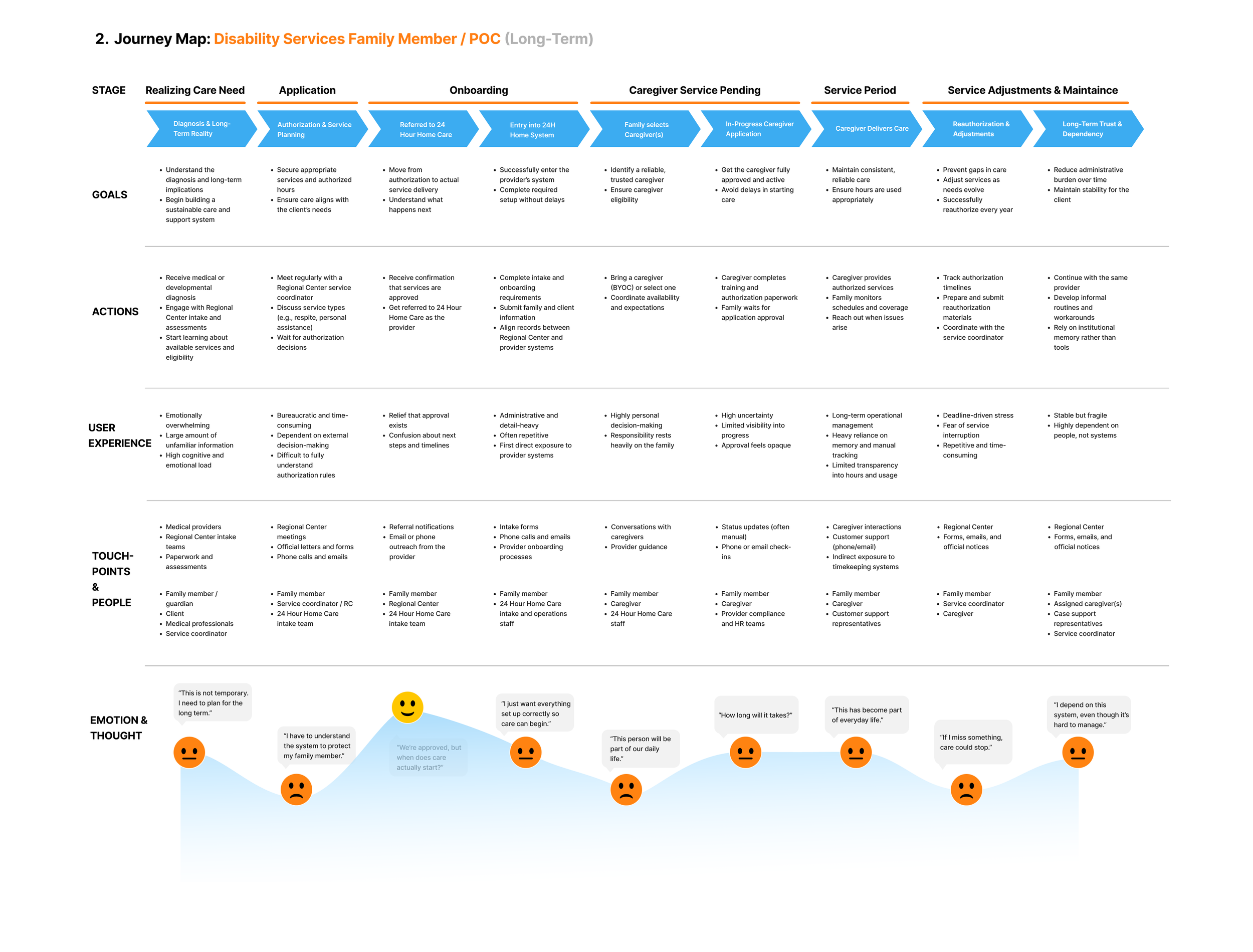
Across both Community Supports and Disability Services, one pattern consistently emerged: families didn’t need more information, they needed better visibility.
how might we…
How might we provide families with clear, real-time visibility into their care journey, empowering them to confidently manage care while reducing repetitive support inquiries?
Starting the design
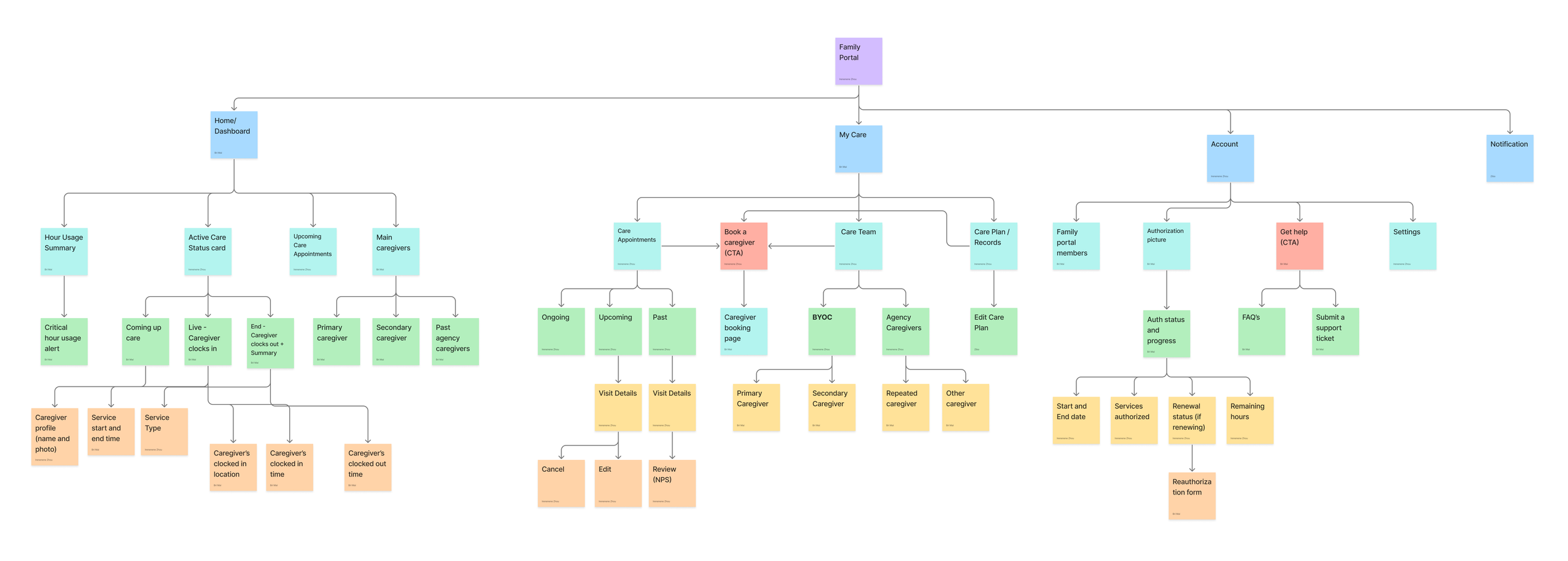
Sitemap
Guided by our research findings and How Might We statement, we redesigned the information architecture to better reflect how families navigate their care journey. Instead of mirroring internal operational workflows, the sitemap organizes information around users’ goals and priorities, making essential tasks easier to discover while creating a more transparent and intuitive experience.
Low-fi wireframes
With the product strategy and information architecture established, we rapidly explored the platform through low-fidelity wireframes. This stage focused on validating user flows, testing different interaction patterns, and ensuring every feature aligned with the needs uncovered during the research phase.
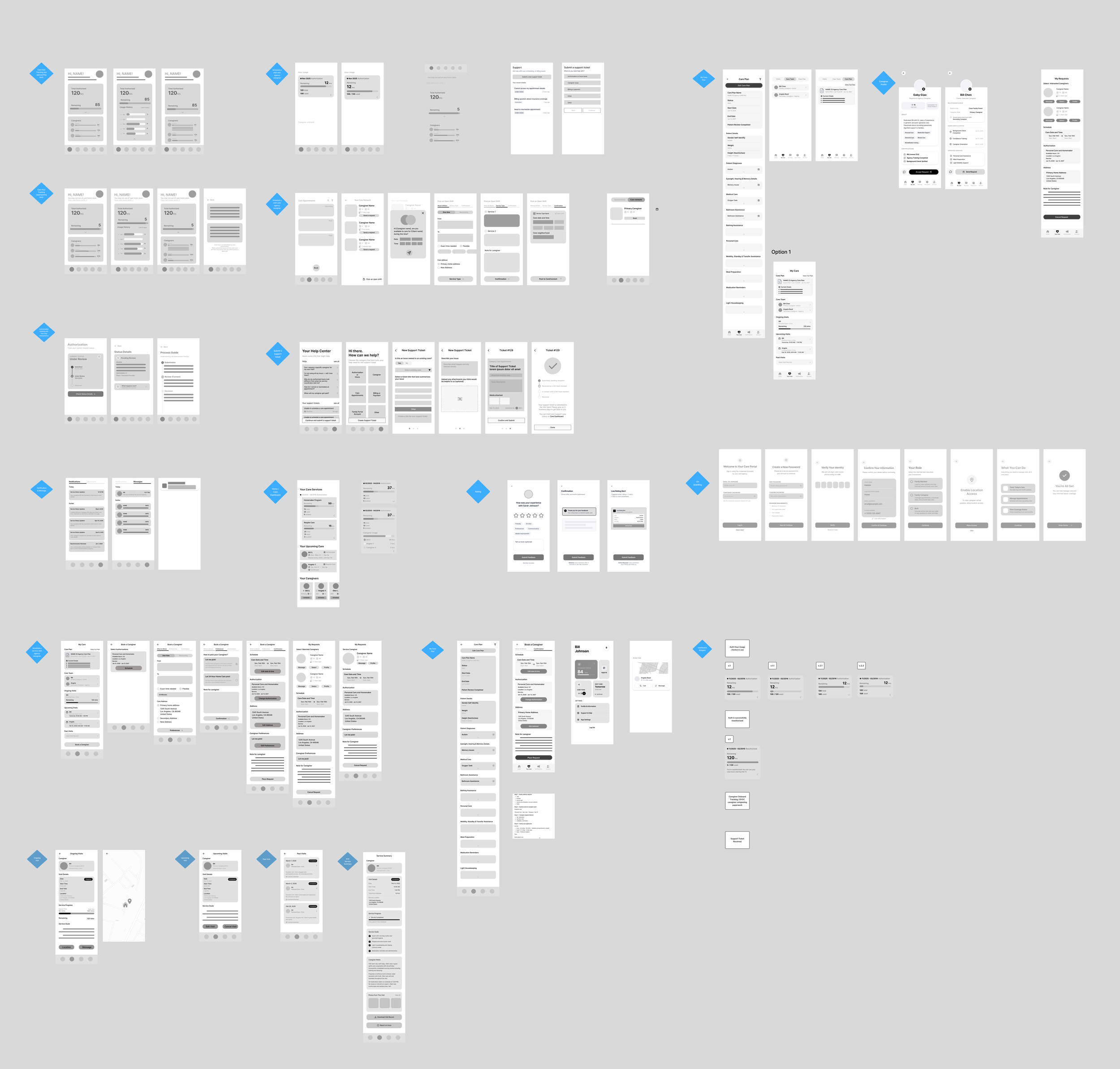
Over 70 low-fidelity wireframes were created to map the end-to-end family portal experience across key workflows, including onboarding, authorization management, caregiver coordination, care plans, scheduling, communication, support resources, account management, and service feedback. This iterative process helped us refine the product structure and user experience before transitioning into high-fidelity prototypes.
mid-fi wireframes & prototype
After validating our low-fidelity concepts with stakeholders, we refined the product architecture based on real business feedback. Rather than focusing solely on visual fidelity, this iteration expanded core product capabilities, clarified navigation, and strengthened key user workflows. The result was a more complete product experience that better aligned with both user needs and operational requirements.
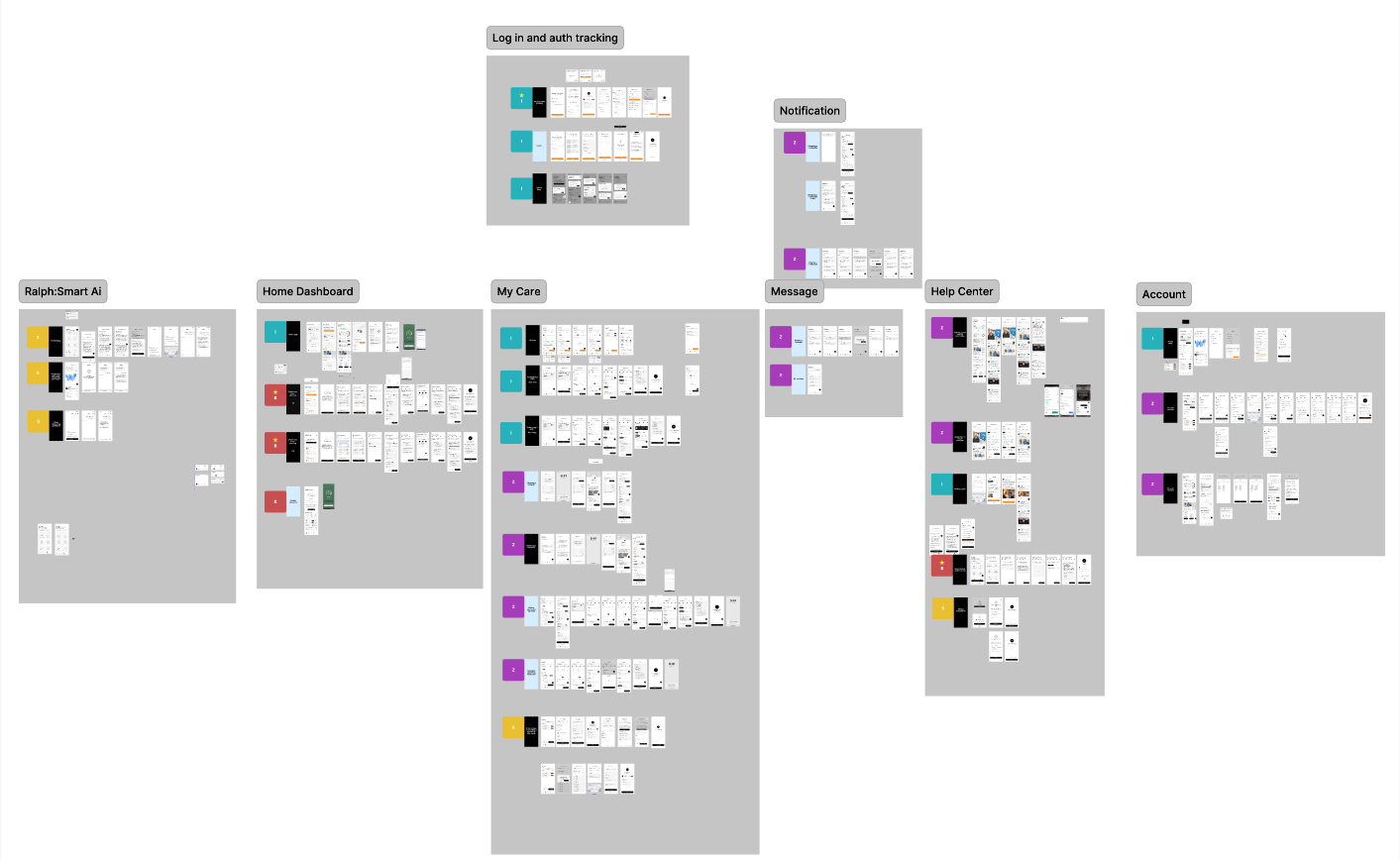
The mid-fidelity wireframes expanded the complete product ecosystem, covering every major workflow across authentication, dashboard, care management, messaging, notifications, support, AI assistance, and account management before transitioning into interactive prototyping.
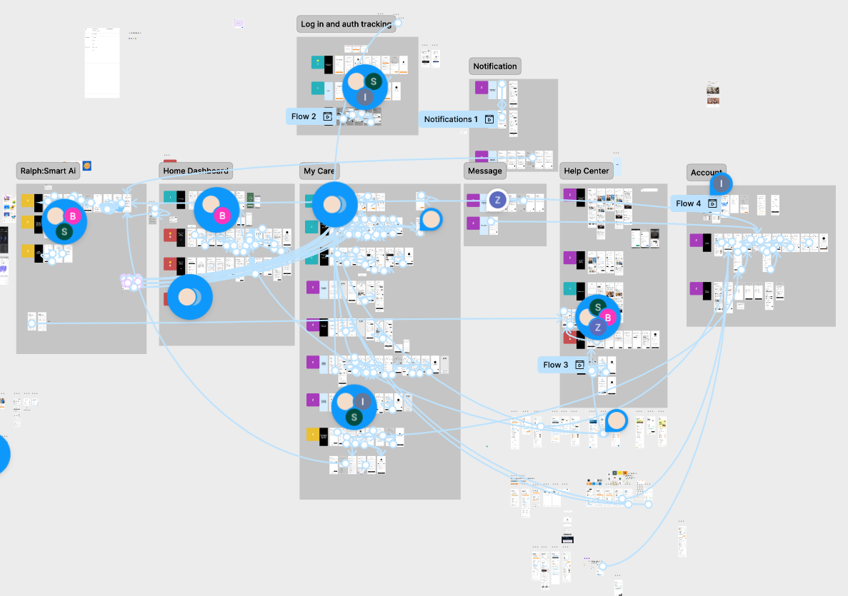
Interactive prototypes were created to validate end-to-end user flows, navigation logic, and interactions across the entire platform prior to visual design.
key product improvements
usability test
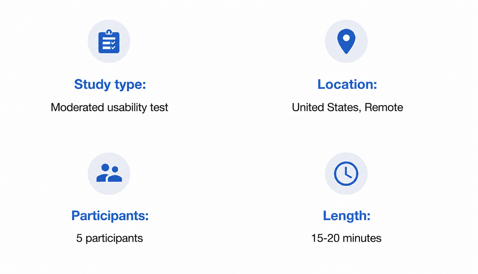
parameters
findings
improvements
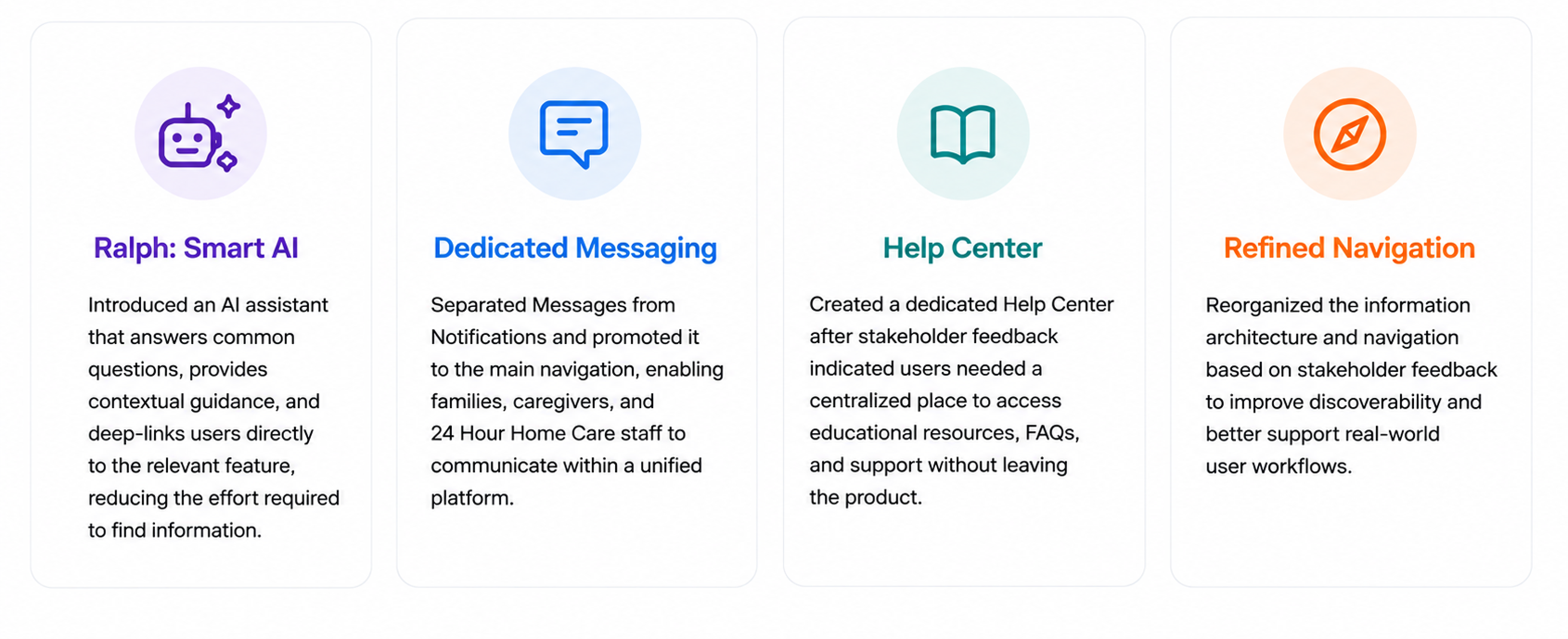
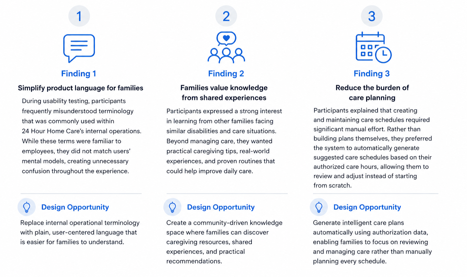
1.Simplifying Product Language: To better align with users’ mental models, we replaced internal operational terminology with plain, user-friendly language throughout the interface. This reduced confusion during navigation and helped families more confidently understand their care status, authorization process, and available actions.
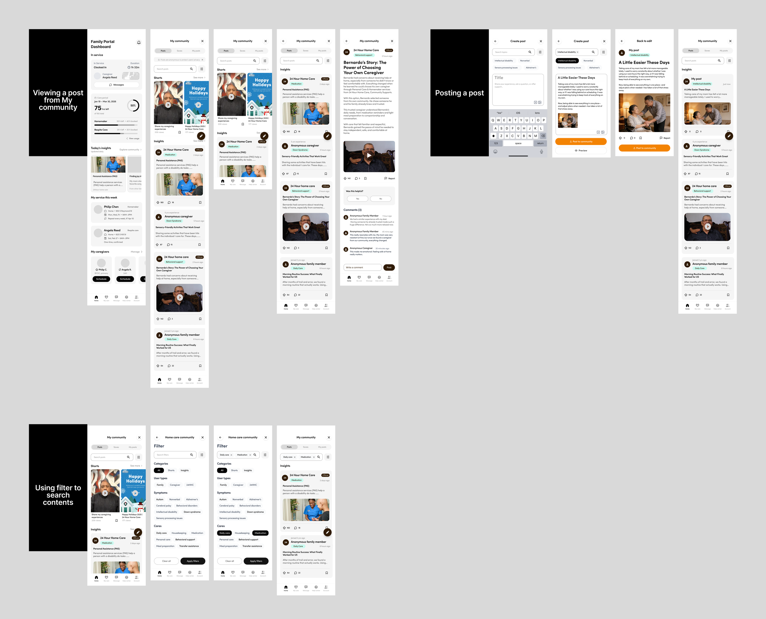
2. Building a Community Knowledge Hub: Participants expressed a strong desire to learn from other families facing similar disabilities and caregiving situations. However, because these discussions often involve highly sensitive personal and medical information, privacy became a key design consideration. To encourage open knowledge sharing while protecting users’ identities, we designed the community experience around anonymous posting and commenting, allowing families to exchange practical caregiving advice in a safe and trusted environment.
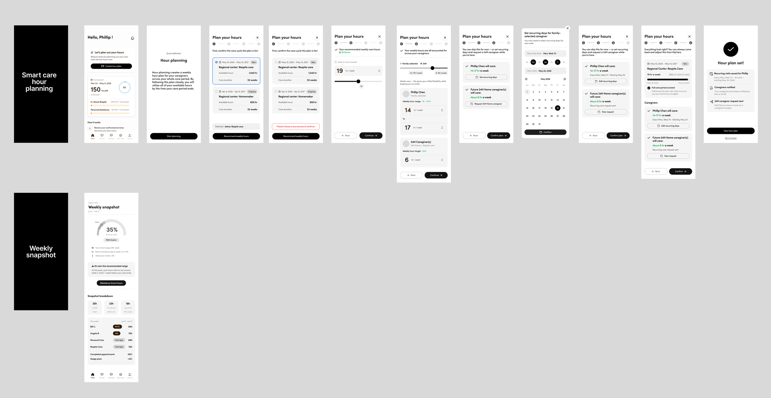
3. Intelligent Care Planning: Participants explained that manually planning and monitoring care schedules required significant ongoing effort. In response, we introduced Smart Care Hour Planning, which automatically generates personalized care schedules based on each family’s authorized care hours, allowing users to review and adjust rather than plan from scratch. To further simplify day-to-day management, we also designed a Weekly Snapshot that provides a concise overview of upcoming services, authorized hours, hours used, and remaining hours, enabling families to quickly understand their weekly care status at a glance.
Mobile High-fi prototype (Selected)
Log in and authuriaztion tracking
Login & Authorization Tracking
Onboarding Tutorial
Home page
Smart Care Hour Plan
My care
My Care Visit, Team, and Plan
Requesting a Visit / One Time
Requesting a Visit / Recurring
Account
Replace a Caregiver
Add a New Family Selected Caregiver
Community Feature
Account Profile
DS Care Renewal
Help center
Submitting a Support Ticket
Terminology & Ralph AI
Mobile High-fi prototype overview
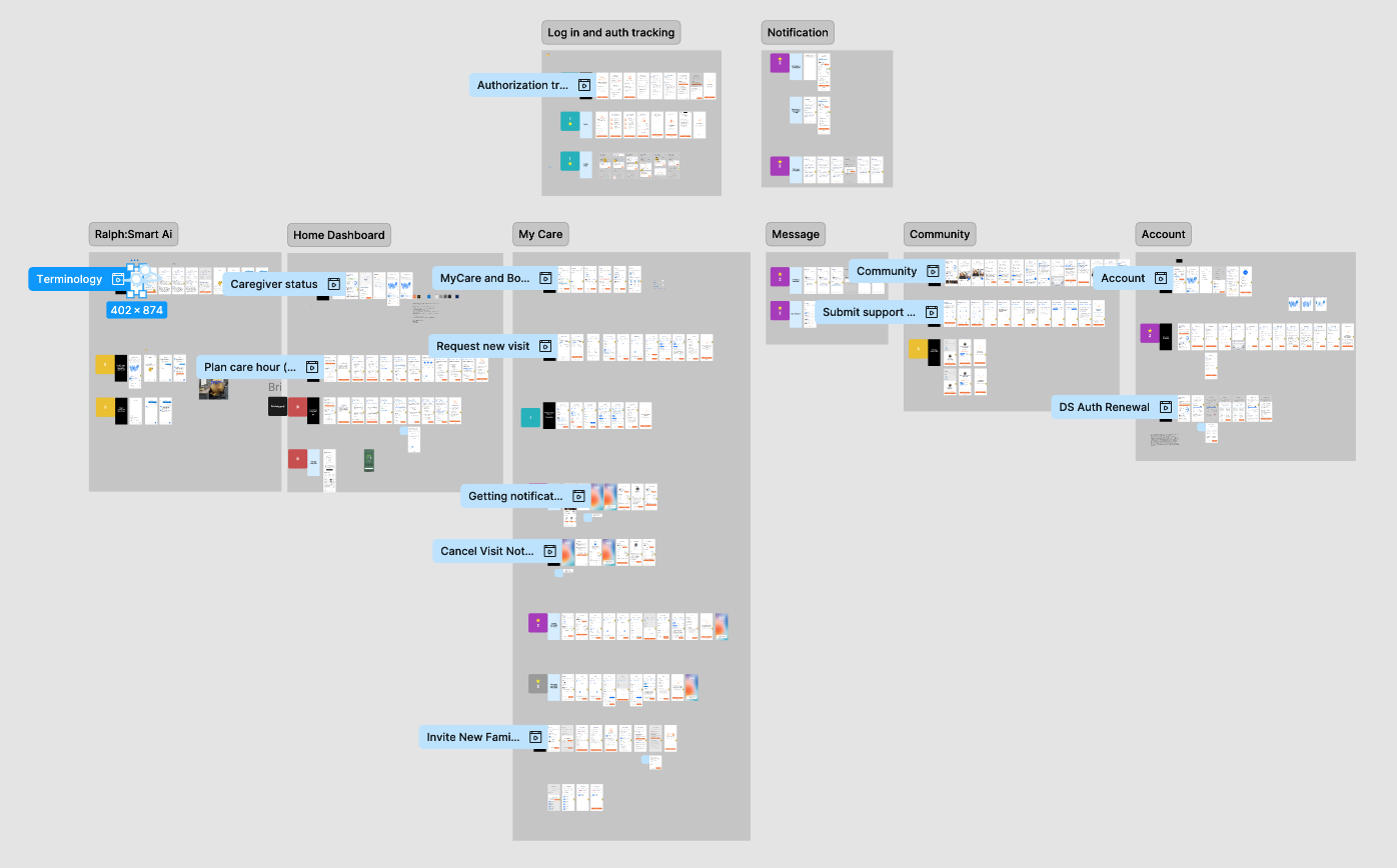
laptop High-fi prototype
Design system
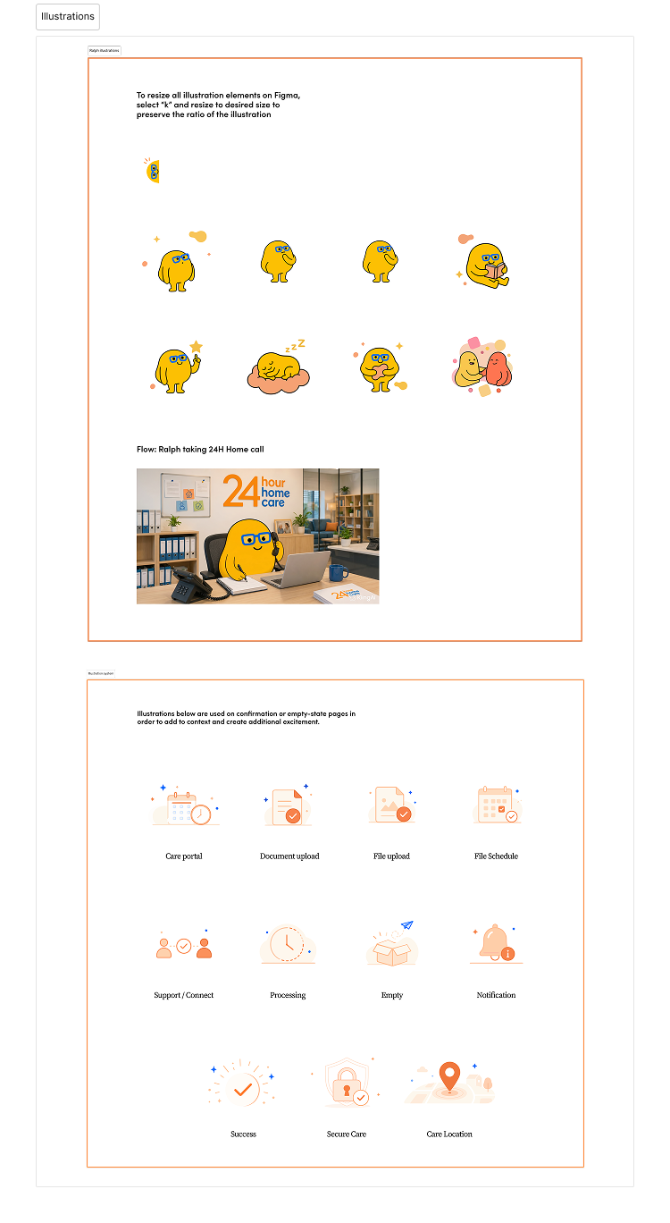
illustrations
Social media post
takeaways
Impact
Our final concept was selected from four competing design teams and acquired by 24 Hour Home Care for future product development. The project delivered an end-to-end family portal across mobile and desktop, helping families better understand care progress, authorized hours, caregiver activity, and upcoming services. By bringing fragmented information into one centralized experience, the solution has the potential to reduce repetitive support inquiries, improve operational efficiency, and give families greater clarity and confidence throughout the care journey.
What We Learned
Working on a real healthcare and social-services product taught us that strong product design requires more than creating intuitive interfaces. Some of the most important lessons included:
Balancing user needs with business, technical, and regulatory constraints
Translating complex internal processes into clear, family-friendly experiences
Using stakeholder feedback and usability testing to guide product decisions
Designing across mobile and desktop as one connected experience
Building scalable systems through Salesforce and custom components
Treating privacy, accessibility, and trust as core product requirements